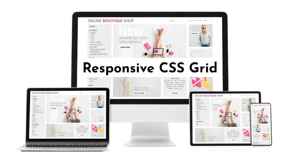
In the modern world, people view web content on a variety of devices. Responsive design means your site resizes and adjusts to the size of the user’s device. This is easy to achieve. Simply build a responsive CSS grid layout.
My beginner-friendly tutorial shows you all the ropes! I included all the code you need to make your site look perfect on any size device.
In this tutorial:
What’s a CSS Responsive Grid Layout?
Using div elements, we will organize the <body> into rows and columns.
<div></div>Rows take up horizontal space and columns take up vertical space (like an Excel spreadsheet).
Columns
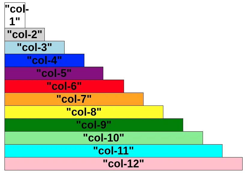
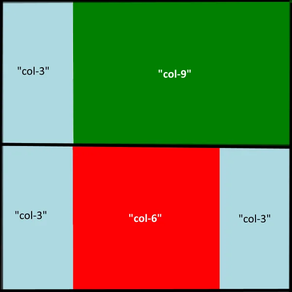
We’ll divide the screen into 12 equal columns.
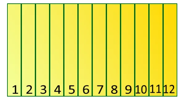
To do so, we create 12 classes. Each class defines a different column width.
- “col-1” will be 1/12 of the screen width
- “col-2” will be 2/12 of the screen width
- “col-12” will be 12/12 (entire screen width)
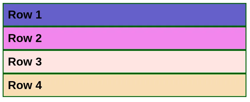
Rows
We’ll also define a row class.
Responsive Grid Layout
We’ll combine rows and columns to create a basic page design.
CSS Code for a Responsive Grid Layout
Box-sizing
Box-sizing defines what is included in an element’s height and width. For our responsive layout, we will make box-sizing for ALL of our elements border-box.
* {
    box-sizing: border-box;
}| Code | Explanation |
|---|---|
| * | Attribute Selector: Used to apply CSS code to elements that contain a particular value in the attribute. We are going to use it to define the column width. |
| border-box | Includes content, padding, and borders. Does not include margins. |
Rows
/* Rows*/
.row::after {
content: "";
clear: both;
display: table;
}| Code | Explanation |
|---|---|
| .row::after | Pseudo-element selector: It targets the space immediately after the content of any HTML element that has the class row. |
| content: “”; | This inserts an empty, invisible piece of content into that space after the row’s existing content. |
| clear: both; | This forces the invisible content to sit below all floating elements inside the row. |
| display: table; | This ensures the new content acts like a block-level element, which is necessary to apply the clear: both; correctly and consistently across all major browsers. |
Columns: Mobile-First Default
The following setup is key because it guarantees a readable, single-column layout on the smallest devices. The media queries you define later only override this 100% width when the screen is large enough (e.g., setting col-6 to 50% width on a desktop).
/* Base Styles for ALL Columns (Mobile-First Default) */
[class*="col-"] {
float: left;
padding: 15px;
width: 100%; /* This is the default width for small devices/phones */
}| Code | Explanation |
|---|---|
| [class*=”col-“] | Column Selector: This is an attribute selector that targets any HTML element whose class attribute contains the substring “col-“ (e.g., col-6, col-12, col-t-4). |
| float: left; | Positioning: This property tells the columns to line up side-by-side inside their parent row, rather than stacking vertically. |
| padding: 15px; | Spacing: This adds a little internal space (15 pixels) around the content within each column, preventing the text and images from hitting the edges of the column container. |
| width: 100%; | The Mobile Rule: This is the most important line for mobile-first design. It sets the default width of every column to 100% of its parent row. |
Media Queries: Responsive Breakpoints
Our setup uses the Mobile-First principle:
- Small Screens (Phones): The base CSS applies
width: 100%, stacking the columns vertically. - Medium Screens (Tablets, 600px+): The first media query applies, allowing columns with the
.col-t-class to display side-by-side. - Large Screens (Desktops, 768px+): The second media query applies, allowing columns with the standard
.col-class to display side-by-side.
/* Column width for large devices (i.e. computers)*/
@media only screen and (min-width: 768px) {
.col-1 {width: 8.33%;}
.col-2 {width: 16.66%;}
.col-3 {width: 25%;}
.col-4 {width: 33.33%;}
.col-5 {width: 41.66%;}
.col-6 {width: 50%;}
.col-7 {width: 58.33%;}
.col-8 {width: 66.66%;}
.col-9 {width: 75%;}
.col-10 {width: 83.33%;}
.col-11 {width: 91.66%;}
.col-12 {width: 100%;}
}
/* Column width for large devices (i.e. tablets)*/
@media only screen and (min-width: 600px) {
.col-t-1 {width: 8.33%;}
.col-t-2 {width: 16.66%;}
.col-t-3 {width: 25%;}
.col-t-4 {width: 33.33%;}
.col-t-5 {width: 41.66%;}
.col-t-6 {width: 50%;}
.col-t-7 {width: 58.33%;}
.col-t-8 {width: 66.66%;}
.col-t-9 {width: 75%;}
.col-t-10 {width: 83.33%;}
.col-t-11 {width: 91.66%;}
.col-t-12 {width: 100%;}
}| Code | Explanation |
|---|---|
| @media only screen and (min-width: 768px) | Desktop/Computer Breakpoint: This is a media query. The rules inside this block only apply when the user’s screen is 768 pixels or wider. |
| .col-6 { width: 50%; } | The Two-Column Rule: This rule takes effect on large screens. It overrides the 100% mobile default and sets the columns to 50% width (6 out of 12 columns), making them line up perfectly side-by-side. |
| @media only screen and (min-width: 600px) | Tablet Breakpoint: This media query applies when the screen is 600 pixels or wider (typical for most tablets). |
| .col-t-6 { width: 50%; } | Tablet Columns: These rules use the unique class prefix (.col-t-). .col-t-6 is 50% width on tablets. |
Images
img {
max-width: 100%;
}This is critical for mobile devices. It ensures that an image will never be wider than the container it sits inside (e.g., your .col-6 column). If the container shrinks on a small phone screen, the image automatically shrinks with it, preventing it from overflowing and destroying your layout.
Sample CSS Grid Layout: JavaScript Dice Game
In my JavaScript Dice Game Tutorial, I use the following responsive layout.
body {
background-color: darkblue;
color: yellow;
text-align: center;
}
/* All elements width includes borders and padding*/
* {
    box-sizing: border-box;
  }
/* Rows*/
.row::after {
  content: "";
  clear: both;
  display: table;
}
/* Base Styles for ALL Columns (Mobile-First Default) */
[class*="col-"] {
  float: left;
  padding: 15px;
  width: 100%; /* This is the default width for small devices/phones */
}
/* Column width for large devices (i.e. computers)*/
@media only screen and (min-width: 768px) {
.col-1 {width: 8.33%;}
.col-2 {width: 16.66%;}
.col-3 {width: 25%;}
.col-4 {width: 33.33%;}
.col-5 {width: 41.66%;}
.col-6 {width: 50%;}
.col-7 {width: 58.33%;}
.col-8 {width: 66.66%;}
.col-9 {width: 75%;}
.col-10 {width: 83.33%;}
.col-11 {width: 91.66%;}
.col-12 {width: 100%;}
}

/* Column width for large devices (i.e. tablets)*/
@media only screen and (min-width: 600px) {
.col-t-1 {width: 8.33%;}
.col-t-2 {width: 16.66%;}
.col-t-3 {width: 25%;}
.col-t-4 {width: 33.33%;}
.col-t-5 {width: 41.66%;}
.col-t-6 {width: 50%;}
.col-t-7 {width: 58.33%;}
.col-t-8 {width: 66.66%;}
.col-t-9 {width: 75%;}
.col-t-10 {width: 83.33%;}
.col-t-11 {width: 91.66%;}
.col-t-12 {width: 100%;}
}
/* Button */
button {
color: darkblue;
padding: 12px; /* Some padding */
background-color: yellow;
font-size: 24px;
border: 1px solid #ccc; /* Gray border */
border-radius: 6px; /* Rounded borders */
margin: 10px;
}
/* Button mouse hover effect */
button:hover {
background-color: #ffcc00;
}
img {
max-width: 100%;
margin: 10px;
}<!DOCTYPE html>
<html lang="en">
<head>
<!--Set the Browser's Visible Area-->
<meta name='viewport' content='width=device-width, initial-scale=1.0'>
<!--Character Encoding-->
<meta charset="UTF-8">
<!--Meta Title-->
<title>Dice Roller Derby</title>
<!--CSS File-->
<link rel="stylesheet" type="text/css" href="style.css">
</head>
<body>
<!--Row 1-->
<div class="row">
<!--Page Heading-->
<h1>JavaScript Dice Game</h1>
<!--Play Button-->
<button onClick="throwdice()">Play!</button>
</div>
<!--Row 2-->
<div class="row">
<div class="col-6">
<h3>Your Dice</h3>
<img src="images/d1.png" id="mydice1">
<img src="images/d1.png" id="mydice2">
<!--Player's Points -->
<p id="player_points"></p>
</div>
<div class="col-6">
<h3>Enemy's Dice</h3>
<img src="images/e1.png" id="hisdice1">
<img src="images/e1.png" id="hisdice2">
<!--Enemy's Points -->
<p id="enemy_points"></p>
</div>
</div>
<!--Row 3-->
<div class="row">
<img src="images/good-luck.gif" id="message" alt="Good Luck!"/>
</div>
<!--JavaScript File-->
<script src="main.js"></script>
</body>
</html>
Enjoy Building Responsive Layouts?
I’m Shelly Selzer, a freelance technical writer. I explain complex concepts in plain English—with relatable, real-world examples.

📬 Subscribe to my blog so you don’t miss a beat.
Also, stay up-to-date by following me on Facebook and X. For business inquires, please see my contact page.